
Case study · Free mobile app · 04 / 04
What’s Next?
Stop deciding. Start doing.
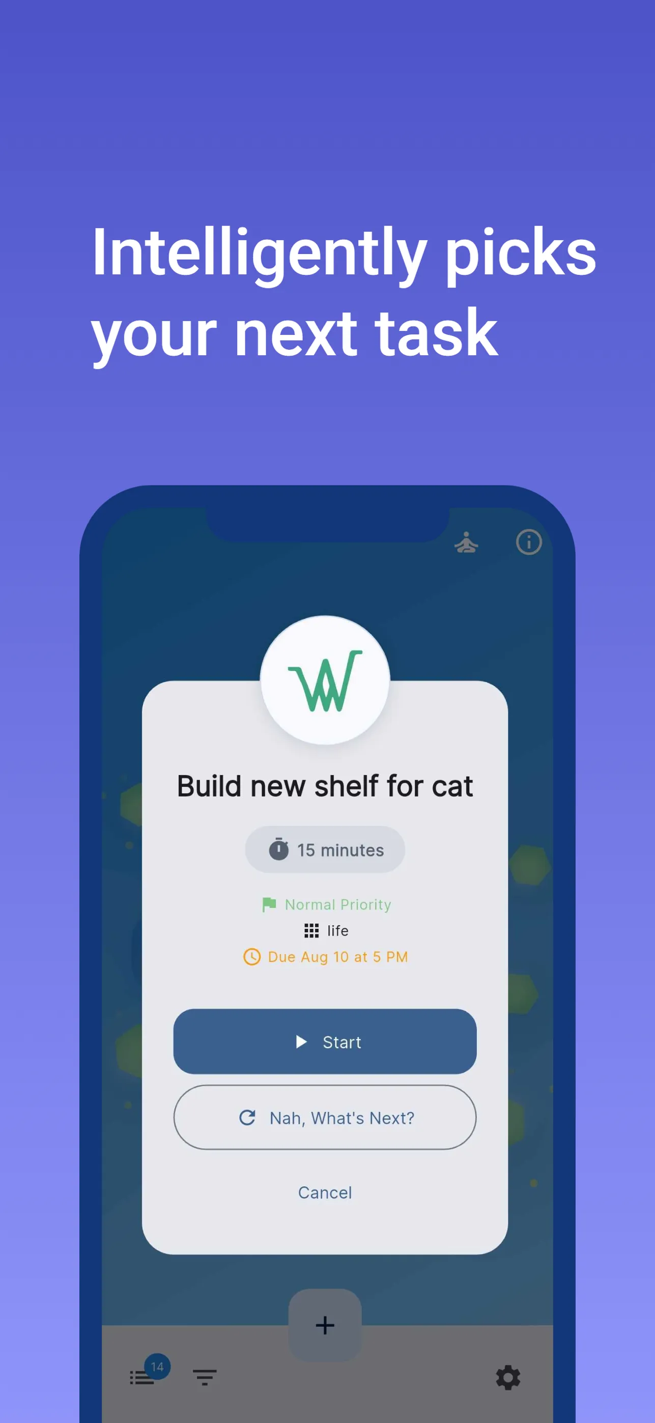
What’s Next? is a mobile task picker built to kill decision fatigue. Keep a list, tap one button, and a weighted draw over priority and deadline pressure surfaces one task — then drops you into a time-boxed work session. Free on both stores; everything stays on the phone.
Of everything on the list — what should I do right now?
The problem
The list isn’t the hard part. The choosing is.
Most task apps are good at storing a list and bad at the moment that actually matters — staring at it with fifteen free minutes, deciding what to do. That decision costs more than the work, so nothing starts.
What’s Next? takes the decision off your hands. WAID answers the macro question — what’s the state of all my projects? This app answers the micro one: of everything on the list, what should I do right now?
Incremental progress is still progress.
One button between the list and the work
Fig. N1 — The core loop
01
List
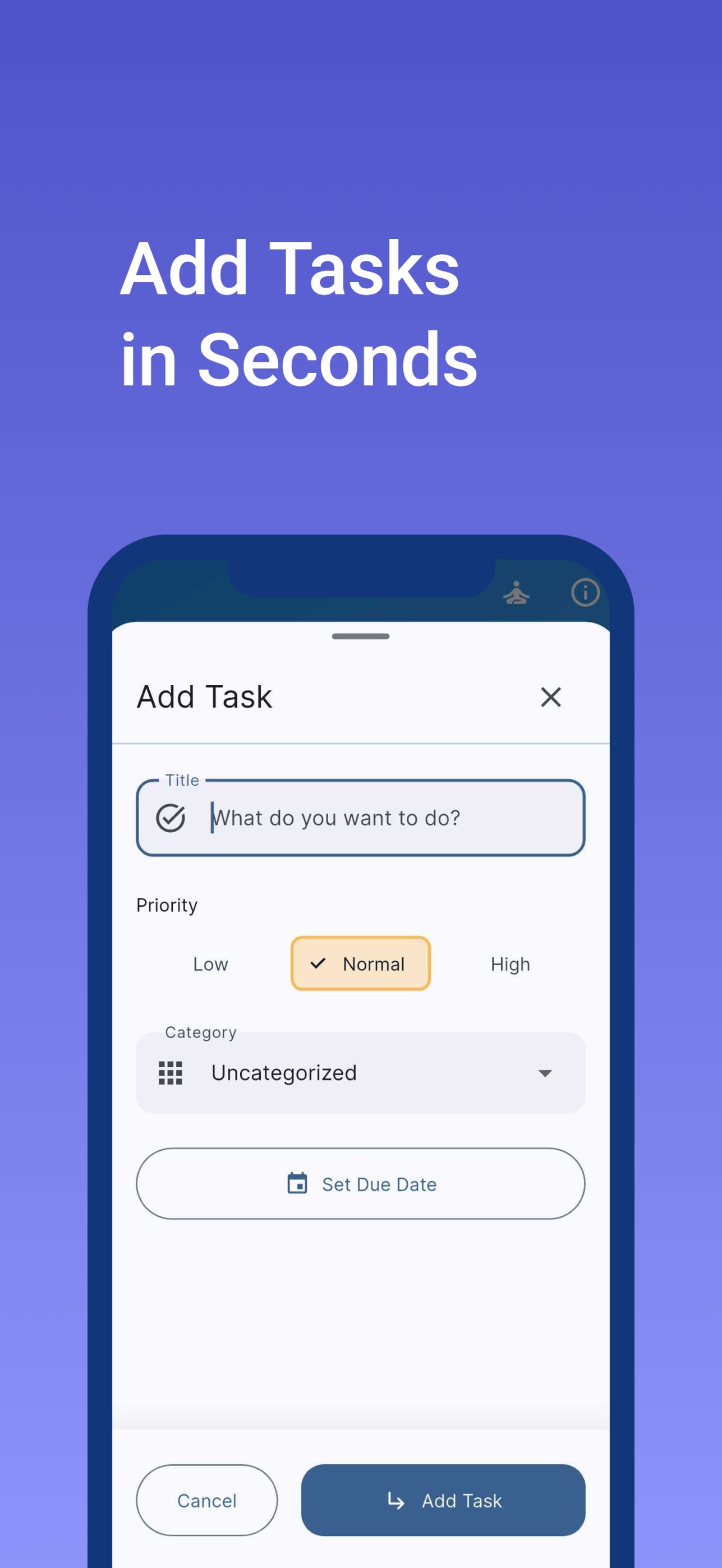
Add a task in seconds — title, priority, category, optional due date. A bottom sheet, not a form.
02
Ask
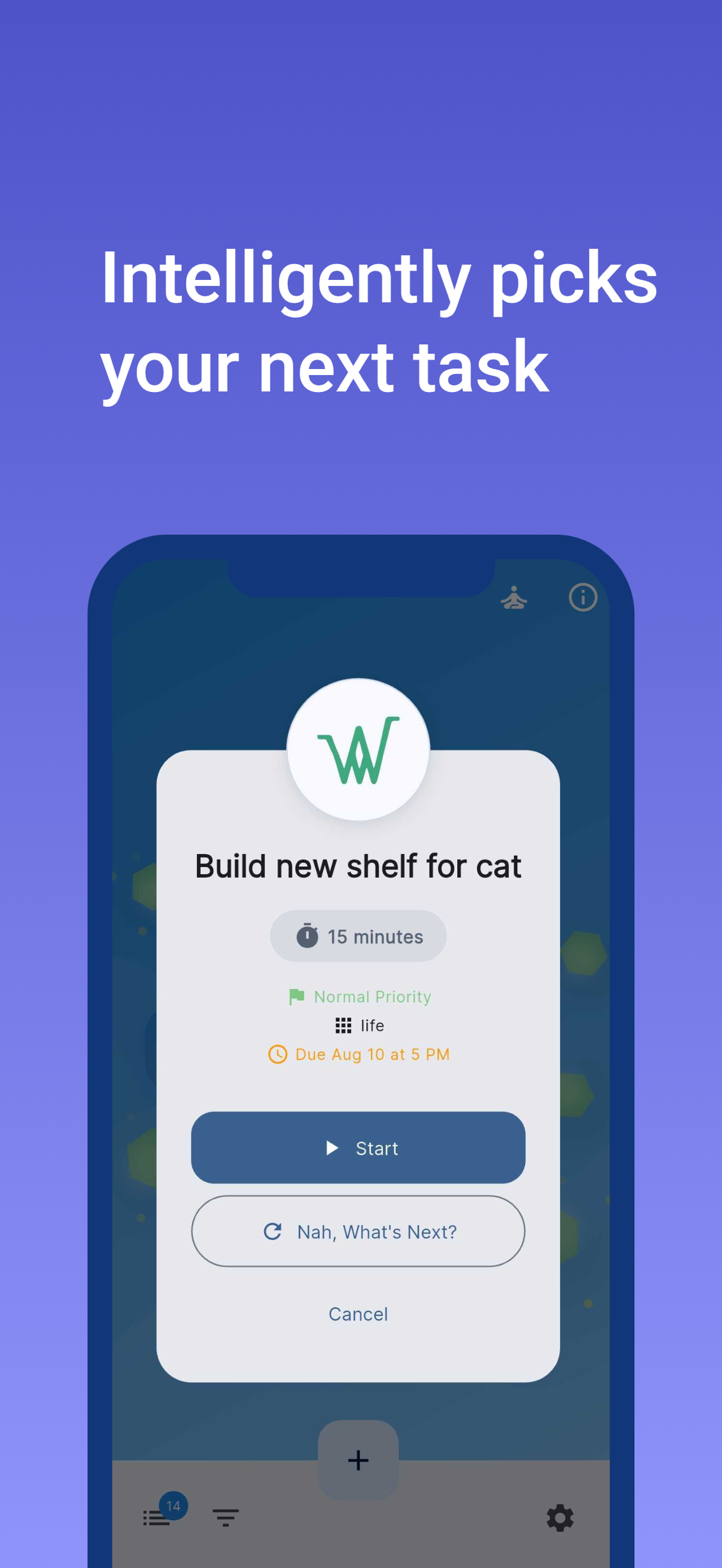
Tap the one button. The picker surfaces a single task — never a ranked list to agonize over.
03
Start — or re-roll
Hit Start, or "Nah, What’s Next?" for a different draw. Either way, the decision took seconds.
04
Session
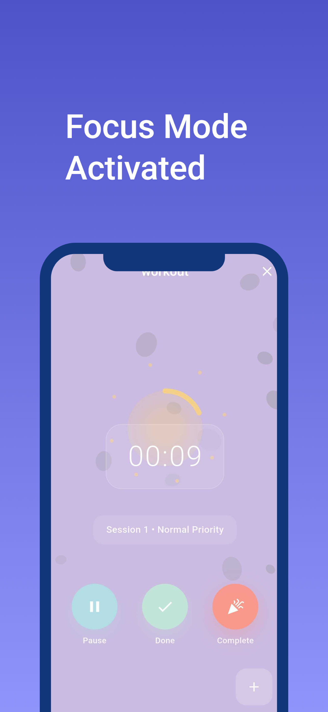
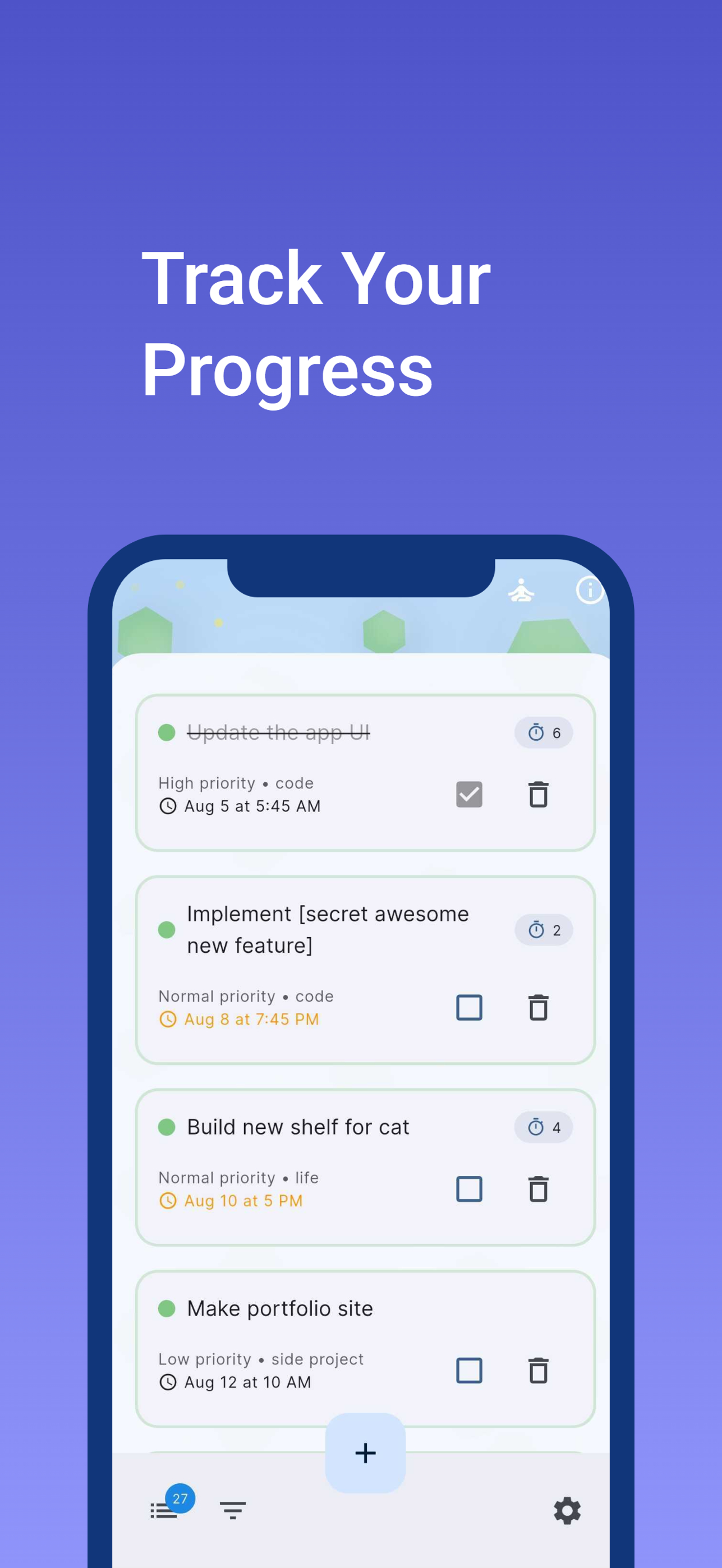
A time-boxed timer runs the work. Finished sessions log against the task, so invested time is visible.
Honest selection
A weighted draw — deliberately not called AI.
The picker is a weighted-random algorithm: priority sets a base weight, and deadline pressure stacks on top as a due date approaches. A high-priority task due tomorrow is dramatically more likely to surface — but nothing is ever guaranteed, and that’s the point. The randomness is what removes the agonizing.
The marketing never calls it AI, because it isn’t. It’s called what it is — smart selection — and it works.
priority        low +1 · normal +2 · high +4
due date        within 7d +1 · 3d +2 · 1d +3 (stacking)
overdue         +1 more
→ one cumulative weighted draw. Tap again to re-roll.
The stance
Free, private, and entirely on the phone.
Tasks, sessions, and settings live in encrypted on-device storage. There is no account, no server, and no network call anywhere in the app — the App Store privacy label reads “the developer does not collect any data from this app.”
The app is free on both stores. Unlike the desktop suite, the source isn’t open — but the privacy posture is the same: your data never leaves hardware you hold.
The interface
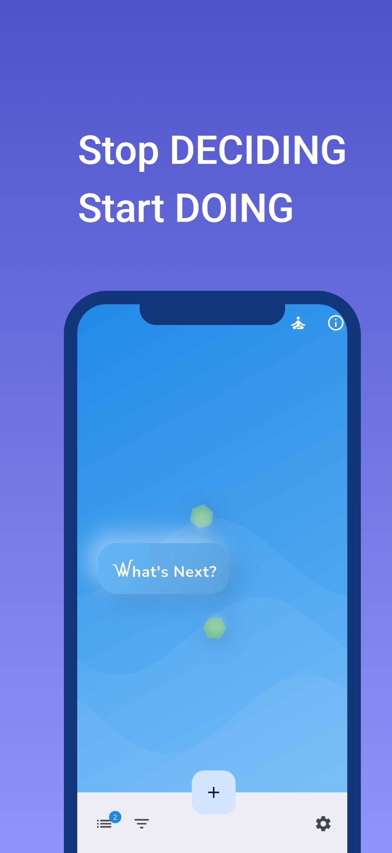
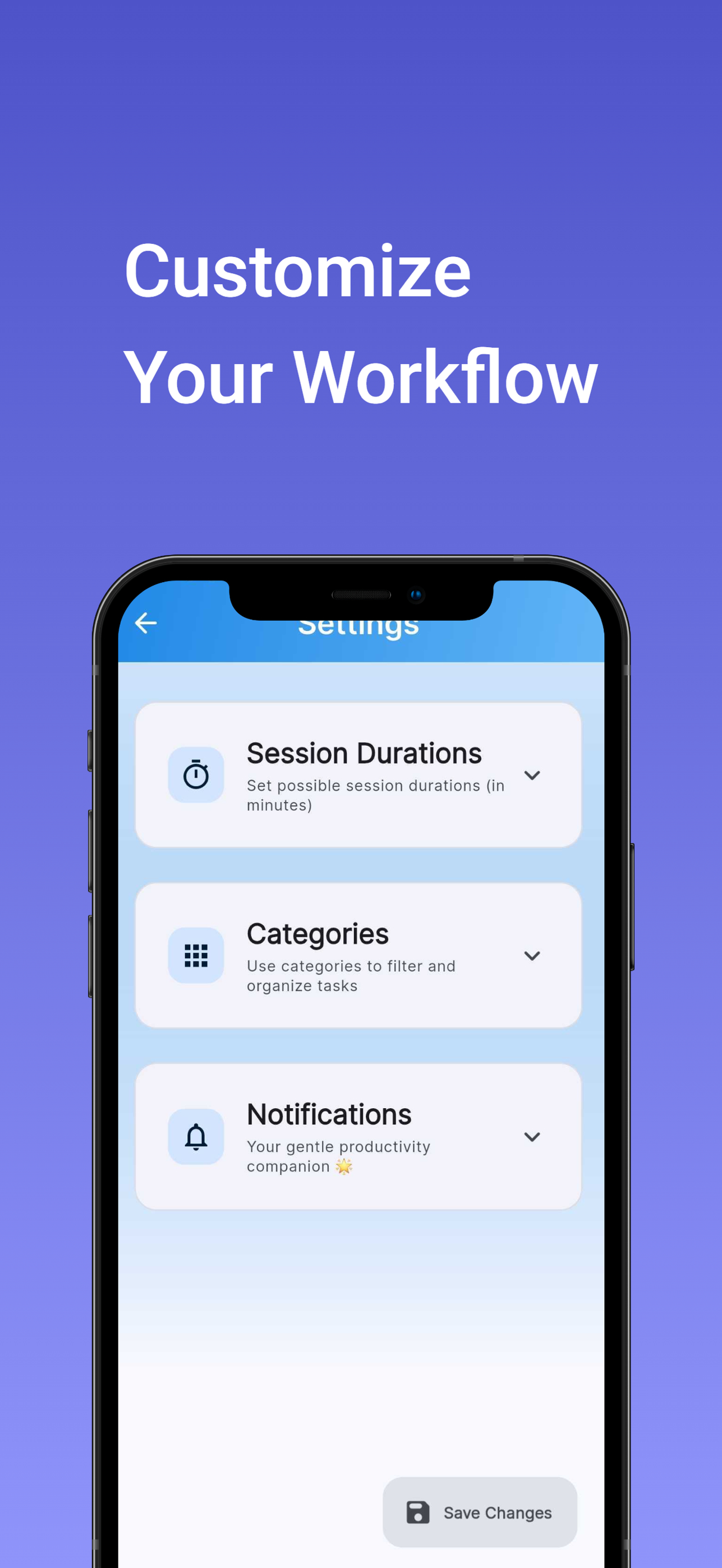
Fig. N3 — Store screenshots, v2
Technical execution
Small stack, no strings.
- Framework
- Flutter and Dart
- State
- Provider (ChangeNotifier)
- Storage
- Encrypted on-device (flutter_secure_storage)
- Reminders
- Local notifications — no push service
- Network calls
- None
- Cloud infrastructure
- None
Product decisions
- The picker is the product — everything else exists to make choose-and-start feel effortless.
- Entry friction is the enemy: capture is a bottom sheet, and the pick is one tap.
- Notification permission is earned — requested only after the first completed session, never on launch.
- No passive app- or usage-tracking; surveillance-flavored UX is off the table.
- Features that would need a backend are deferred rather than forcing infrastructure.
In progress: a refactor
Fig. N4 — Current state
The app is live and in daily use, and a refactor is underway — modernizing the codebase and interface release by release. On the roadmap, in order of how much entry friction they remove: share-sheet capture from any app, a home-screen widget, and folding time already invested into the picker’s weights.
The decision is the product.
Everything in the app — the rocks, the orb, the one button — exists to make choose-and-start cost almost nothing. Be it short or long, incremental progress is still progress.
One list. One tap. One task at a time.